Great interface disasters
Originally published 2007 in Atomic: Maximum Power ComputingLast modified 08-Feb-2013.
Computer users are accustomed to dumb user interfaces.
Many, many applications "just growed" from a simple v1.0 to a fifty-times-as-big v8.76g, and the developers often just put new things where they fit. Many large software companies have dysfunctional user interface departments; many small developers don't have such a department at all.
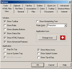
The text editor I'm writing this in is NoteTab Pro, which is generally very good but puts most (not all!) of its configuration options in a little window which contains no fewer than seventeen tabs.
(Which actually isn't all that many, by awful-interface standards. The old Interface Hall of Shame has some corkers.)
The tabs have many entirely straightforward and non-overlapping titles. Like "Files" and "Documents". Or "HTML Files" and "Internet". Not to mention "General", which would I suppose be called "Miscellaneous" if that wasn't too long to fit.
This sort of thing is perfectly normal. Everybody does it, on Windows and Mac OS and definitely, definitely Linux. But once you learn a given interface, you're pretty much OK. You may still go nuts when you fat-finger a hotkey combination you never knew about and place a little bookmark in your document that you don't know how to remove, but by and large you're all right once you've climbed the learning curve.
Real interface disasters achieve more than this.
They annoy you every single time you use them.
When executed particularly stylishly, they actually completely mystify you every time, reducing you to precedent-free trial and error as you attempt to make the thing in question do what you want.
There are lots of non-standard Flash streaming video players that qualify, here. They have one button for the play/pause function, but it's difficult to tell what state the player is in, when what you want it to do is silently download the video while you do something else so you don't have to wait for buffering.
Perhaps the play button turns into a pause button when you click it. But does that mean you're in the mode the symbol indicates, or does it mean you'll get the indicated mode if you click the button?
(The first famous program to have this problem was the 2000-vintage QuickTime Player.)
Further examples are easy to find.
What kind of idiot, for instance, makes a car stereo with a tuning knob and volume buttons? Let 'em loose on the whole vehicle and you'd have an accelerator wheel and a steering pedal.
And there actually exist in the world vending machines that can never dispense anything from column 10 or higher, because as soon as you ask for row "C" (for instance) and press "1" for the first digit of the column you want, you get product C1.
Interfaces have been important for as long as people have been using tools, but they're becoming more and more important as the computer revolution continues.
We may or may not ever end up as machine-people full of tech to augment our mind, senses and muscles, but we're actually conceptually close to that state already. Most nerds, like the early version of Manfred in Charles Stross' Accelerando, already feel somewhat lost when we're away from our Internet teat.
We may not have those wonderfully newsworthy Net Withdrawal Symptoms, but we miss being able to dip into Wikipedia to fill gaps in our knowledge, or look up something on our blog to remind us how we solved a problem. Slow, strange chunks of our brains are already living in cyberspace.
User interfaces stand between our protein neurons and the silicon neurons of what I'd call "our nascent exocortices", if that didn't sound so wanky. And they're going to keep standing between those two things until we manage to come up with an interface that really is as simple as thinking. Which is not a development for which I recommend you hold your breath.
If the software you use is becoming part of your brain, then defects in that software, definitely including bad interfaces, become a form of brain damage.
I bet you were already calling them that, without even knowing how accurate it's becoming.
Herewith, some Usability Nightmare Links that I didn't manage to work into the above text.
Raymond Chen: "If you have to ask, you're probably doing something wrong."
Mobile phones specially designed to prevent people from using them while driving, by instantly distracting to the point of road-accident death anybody who does.
Remote controls with a billion buttons.
Tabs tabs tabs tabs TABS! (NoteTab Pro clearly isn't even in the running.)
The "peanut butter theory of usability", which states that you can just apply usability to any old thing, and if you spread it on thickly enough you'll be OK.
Many command line utilities that have 298 possible options have been rendered usable enough by a GUI wrapper. The most obvious way of making such a wrapper, though, is seldom the best.
(Don't miss the link to the glory that is FileMatrix in the above post. The FileMatrix has you!)
Zillions of identical buttons on clock radios. Just the ticket for sleepy users!
If you really try, though, you can boil this down to just one button that doesn't work!
An interface that looks horrifying at first, though, may actually work OK. Look at Bulk Rename Utility, for instance.


